Envision Kubecost in a New Way: Frontend Redesign is Out
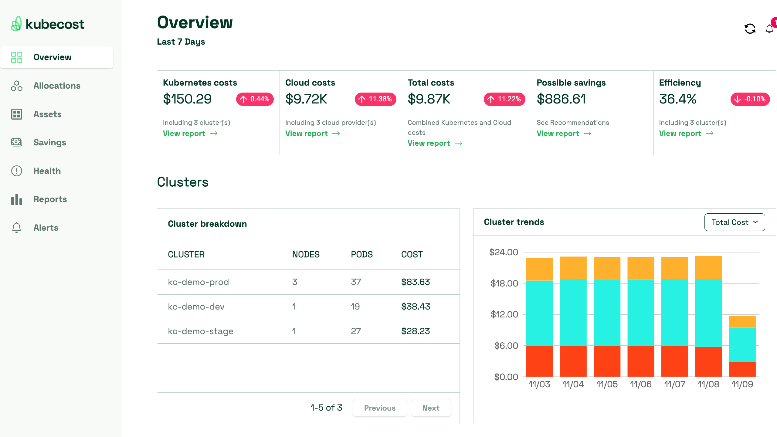
A good UI is hard to find. As users, we want a frontend that understands and anticipates our intentions better than we do. Every feature should be easily accessible, when and where we need it. It’s not just about visuals—functionality matters, too. We kept our own experiences as users in mind (along with incorporating feedback from our community) when we set out to redesign the frontend experience for Kubecost, and we’re excited to share our new web UI, one we hope will bring a fresh aesthetic to the world of Kubernetes cost management.

We kept clarity and consistency as the two main goals for our UI development. When it comes to handling financial and technical information of any kind, data visualization is a crucial element to a successful web UI. A more cohesive color palette, sleeker information panels, and reworked filtering menus in the form of dropdowns are a few examples of the improvements that helped us create a uniform look and simplified workflows. We’ve also introduced crisp, restyled text and graphics for enhanced readability. Longtime Kubecost users won’t feel any learning curve using the new UI, since existing features like the cost allocation and asset metrics are just as accessible. Meanwhile, those still onboarding will benefit from a more intuitive design, making it even easier for them to realize the value Kubecost provides to cost monitoring.
Although the impact of a positive cosmetic change is often understated, we didn’t stop there—Kubecost’s new web UI has improved functionality as well. We’ve reduced latency and improved page loading time, making it more convenient than ever to retrieve and analyze your cost data. Finally, additional functionality for navigating between pages has been improved, including consistent back tiles across all pages so you don’t get lost navigating through all your data.
Continuously improving the Kubecost experience
With the launch of our new frontend, Kubecost makes it easier than ever to understand and allocate costs across your Kubernetes and out-of-cluster assets. We believe intuitive, accessible, and convenient access to relevant data helps teams make more informed decisions, and allows them to take ownership over their Kubernetes cost management. Our team would love to hear from you if you have feedback on the new design, reach out to us on Slack or at support@kubecost.com if you’d like to share your thoughts!
We’re here to help!
Get in touch with a Kubecost team member to learn more about Kubecost Enterprise or request a custom demonstration.
Join us on Slack if you have questions or feedback, need help, or for general Kubernetes and cloud cost optimization conversation!